The real thing, running here. Hover to scroll it, or click to use it — Escape stops.
Built for someone, not as a demo
This is the one site here that isn’t hypothetical in either direction — the business is real, the person running it is real, and the thing stopping it from being live is two bracketed placeholders and a confirmation that hasn’t happened yet. That’s a different kind of unfinished than “the idea came before the paperwork,” and the write-up says so rather than blurring the two together.
Two rounds of options, not two rounds of guessing
The clearest thing about how this one got built is what happened when a design choice didn’t land. The first palette felt flat once it was actually built — rather than try a single replacement and hope, four complete directions went up side by side for a real comparison. The same thing happened again later, once the chosen palette still read as “too much pink” across the page: not a tweak, a second four-way canvas.
Both times the feedback that triggered the rebuild was short and specific — flat-out rejecting a colour the same day it shipped, pointing at a repeated tone across sections. Both times the answer was options, not a guess dressed up as a fix.
What’s still a placeholder, on purpose
The contact card currently reads [Add phone number] and [Add email
address], visible exactly as written rather than smoothed over for a
screenshot. The form’s own mailto: target points at a .example address
that cannot resolve, chosen deliberately so nobody accidentally emails a
stranger before the real details are in. None of this is hidden, because a
site that looks finished when it isn’t is the kind of small dishonesty that
costs more to walk back later than it saves now.
What was decided, and what was deliberately left open
A trademark-adjacent name was ruled out before it became a problem. No testimonials exist, because none are real yet, and the site says that plainly rather than inventing some. “Insured and bonded” isn’t claimed, because it isn’t confirmed. Pricing is checked against three real cost guides for the area rather than invented. The stock photography is a conscious trade-off, flagged at the time it was made, not something to silently revisit later.
Refinements
How it changed
Every pass, dated, oldest first — nothing trimmed and nothing tidied out. The version that got rejected is usually more informative than the one that shipped.
9
- Started
Named around a trademark risk, not into one
The first name considered was a nod to a famous fictional housekeeper — rejected immediately, because a real small business trading under a name close enough to a studio-owned character is a genuine legal risk, not just a style choice. "English Rose Clean Co." does the same persona work through an ordinary British idiom instead, with nothing to clear.
Functionality - Note
No invented testimonials
There are no reviews yet, because the business hasn't started. Rather than write placeholder quotes that would read as real feedback, the trust section is a standards checklist instead — what gets checked every visit, not who supposedly said so.
Quality of life - Note
No "insured and bonded" claim
A badge like this is exactly the kind of claim a visitor takes on faith. It isn't confirmed true, so it isn't on the page — left as an open question for the business owner to answer before it's added, rather than assumed and corrected later.
Quality of life - Changed
Pricing pulled from real cost guides, not estimated
The rate card is checked against Care.com, SanCrew and HomeGuide's published figures for the San Francisco, Pacifica and San Mateo County area, dated to the month this was built. A rate card that looks precise but was never checked against anything real is worse than no rate card.
Functionality - Fixed
A four-way comparison, because "too flat" needs options, not a guess
The first palette — brass and linen — read as a generic templated card once it was actually built. Rather than guess at a single replacement, a comparison canvas was built with four full directions side by side: Seaside Cottage, Brass & Linen, Chintz & Teacup, Mayfair Monochrome. Chintz & Teacup won — cream, rose and sage, with Cormorant Garamond headings over Karla body text.
Style - Fixed
"i hate it" — reverting a colour the same day it shipped
A deep green top band was tried for the hero, to carry white headline lettering. The reaction was immediate and exact. Reverted to a deep plum instead — same family as the rose and blush palette already chosen, so the white lettering stayed without the colour that had just been rejected outright.
Style - Fixed
A second comparison canvas, for "too much pink"
Once the palette settled, the alternating section backgrounds still read as too much of one colour repeated. Rather than tweak a single shade, a second four-way canvas compared full treatments — Porcelain, Dove & Rose, Plum Bars, Oyster & Gold. Porcelain won: alternating sections are now cream and true white, not cream and blush, with a thin gold hairline at every seam. The pattern of building real options rather than guessing a replacement worked twice in this project.
Style - Fixed
The duster was invisible on its own background
The feather-duster animation beside the headline was first built in pale cream feathers on a cream page — present in the code, invisible on screen, and it only ever ran once on page load. Recoloured to rose and gold, set to loop on a twelve-second cycle, and made to pause correctly under prefers-reduced-motion. A broken animation is at least visibly broken; an invisible one just looks like nothing was built.
Functionality - Note
Stock photography, chosen rather than defaulted to
Three free-commercial-use photos stand in for real ones of the actual houses this business will clean. The honest cost was stated plainly before the choice was made — stock photography reads as generic for a business that sells personal trust — and the choice to use it anyway, rather than wait, was made knowing that. Recorded here so a later pass doesn't silently swap them without asking again.
Quality of life
- Note
Recovered after the session that built it was lost
The working copy lived only in a chat scratchpad, which was wiped when the app quit mid-session. The current file was recovered by reading it back out of the still-published preview rather than from any local copy — the exact failure mode a durable, version-controlled home for a project is meant to prevent, and now does.
Quality of life
Screens
A look around
Look around — 4 screens
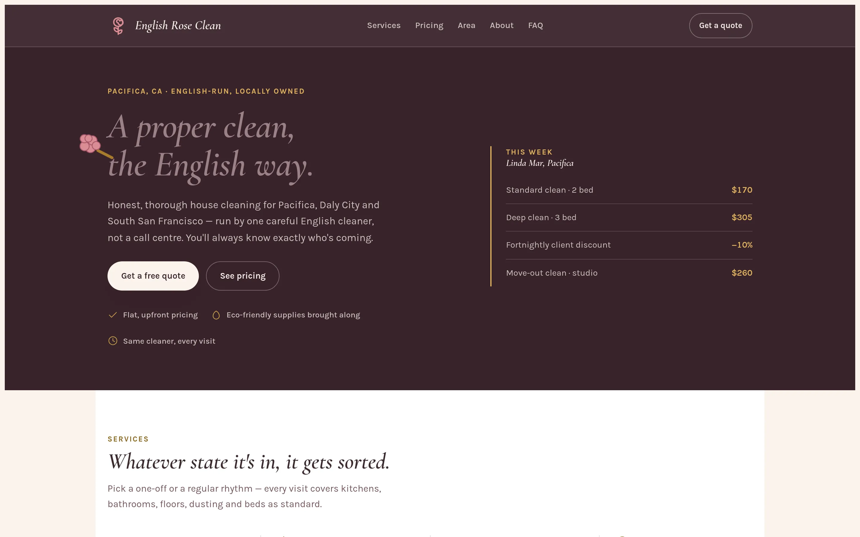
"A proper clean, the English way." A rose-coloured feather duster sways behind the headline on a loop, paused under prefers-reduced-motion. 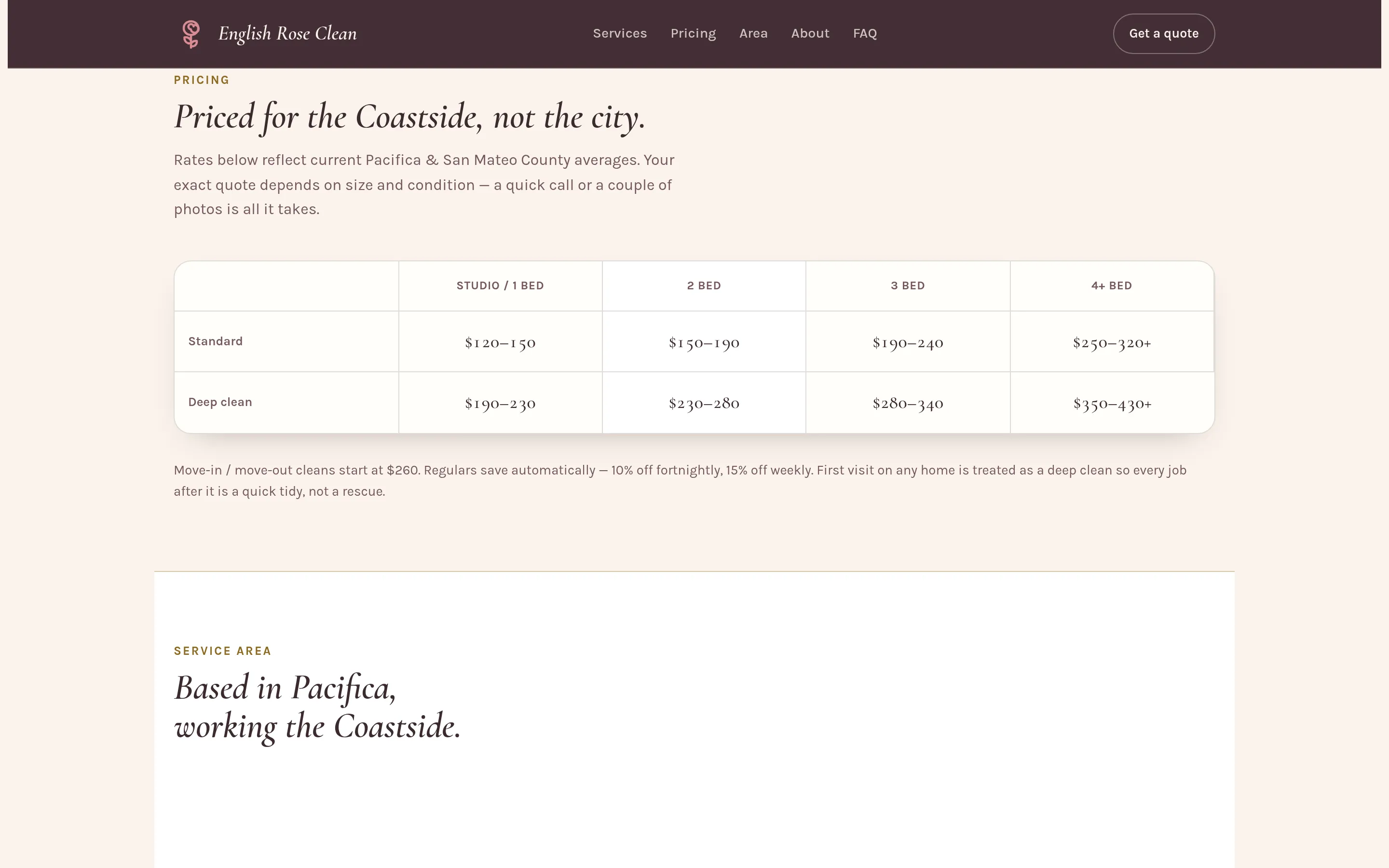
The rate card — by home size and clean type, researched against three real cost guides rather than guessed. 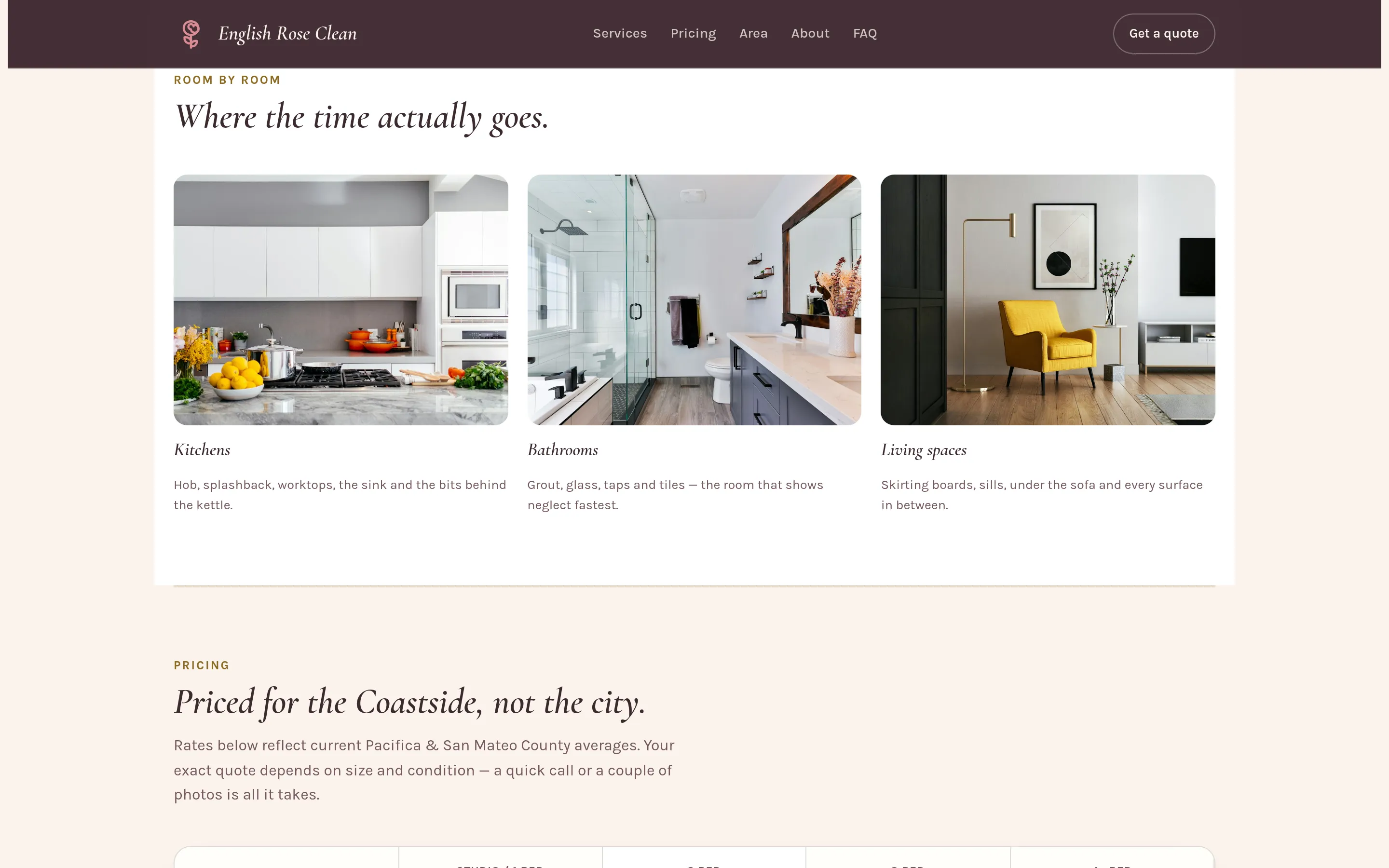
Kitchen, bathroom, living room — stock photography, kept deliberately rather than waiting for real ones. Flagged as a trade-off, not hidden as one. 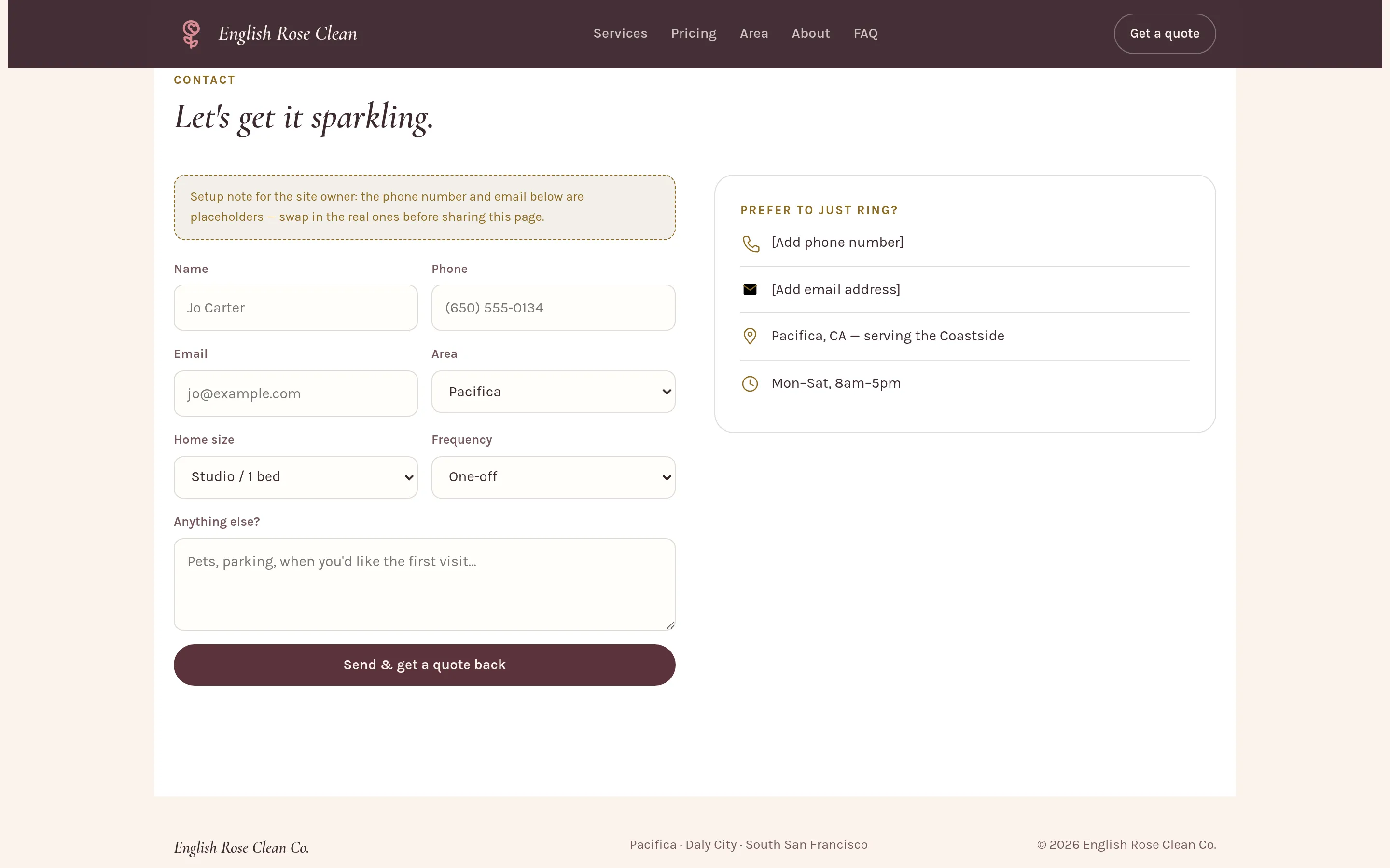
The contact card still reads "[Add phone number]" and "[Add email address]" — visible here because that's genuinely where it stands, not polished over for a screenshot.