Cleo Culver Real Estate
A realtor site built around her camera — and the buyers who are actually buying.
The real thing, running here. Hover to scroll it, or click to use it — Escape stops.
Built for a real agent
This one isn’t a concept. The REALTOR® is real, the licence number is real, and so are the phone number, the office and the 5.0 rating. That raised the bar on what could be invented. Anything that would read as a fact (a review, a listing, a stat) is either sourced or labelled as a sample.
The camera is the brand
Most agent sites lead with a search box. This one leads with her on camera, because that’s what she actually does, and because video is where buyers are: 73% use YouTube for housing content and 76% of Gen Z prefer TikTok (Realtor.com, 2025). The site is built so one clip can feed every platform and every page.
Every choice reversible until the client makes it
Eight palettes, day and night, two typefaces, all live. The review page lets her try them on and copy her pick to send back. One config line then locks it in and removes the picker. Nothing was chosen for her that she can’t change by tapping.
What’s still open
The listings are samples until eXp provides an embeddable live feed. The reviews are samples until her real ones come in. The forms run in preview mode until an inbox is connected. The little-black-book picks are placeholders until she sends her own favourites. All of this is stated here and on the site rather than polished over.
Refinements
How it changed
Every pass, dated, oldest first — nothing trimmed and nothing tidied out. The version that got rejected is usually more informative than the one that shipped.
- Started
The first version
Five static pages — home, about, listings, videos, contact — on a clean slate-blue template, with three of her own square, caption-burned social videos. It worked, but it could have belonged to any agent.
Functionality
13
- Note
Found filed under Pictures
The site turned up in the Pictures folder with no notes and no history, plus a dist folder that was a byte-for-byte duplicate of the source. Moved into the project archive with a notes file before anything else was touched.
Quality of life - Note
An honest audit before any redesign
Nine invented listings at prices no Bay Area buyer would believe, testimonials from people who don't exist, a contact form that waited 1.5 seconds and threw the message away, an About photo hot-linked from an Instagram URL that had already expired, grey "Placeholder" boxes and a 2025 copyright line. Each one was written down before it was fixed.
Functionality - Changed
Rebuilt around the camera
Her videos were the strongest thing she had, so the brief became video-first. The hero is a viewfinder playing her tour, with a REC light, live timecode, progress bar and tap-for-sound; every film opens full-screen with sound. Her portrait is a frame pulled from her own video, cropped to leave out a team sign.
Style - Fixed
Samples labelled as samples
The client wanted the invented testimonials and listings kept for now. They stayed, but each review carries a small "Sample review" tag, and the listings show a neighbourhood and city, never a street number that could point at someone's real house. Beside them sits a real number: a verified 5.0 from every RealSatisfied review.
Quality of life - Changed
Choosing a look by trying it on
Four palettes, each with a day and a night version, switchable from a thin bar at the top of every page. Carl picked Rosé as the default. Once the client decides, one line in a config file locks her choice in and the bar disappears.
Style - Fixed
The choice didn't follow you between pages
Opened straight from disk, Firefox gives every local file its own storage, so a palette picked on one page was gone on the next. The choice now also travels in the site's own links. On a real domain the browser remembers it and the links stay clean. Tested with storage switched off entirely.
Ease of use - Fixed
"I worry people won't find it very readable"
The Bodoni headlines looked expensive, but at display sizes their hairline strokes all but vanished, especially on phones and at night. Three options were rendered side by side: the original, a sturdier optical size, and Fraunces. Carl chose the thickest — "much better" — and Bodoni stayed on a toggle so the client could still compare.
Style - Changed
A map that draws itself
An animated map of the towns she covers, built from OpenStreetMap coastline data, clipped to the Bay Area and smoothed so it reads as designed rather than traced. On scroll it draws the coast, fans routes out from her San Ramon office, pops in the towns and blooms a coverage glow. It re-colours with every palette and works by tap on a phone.
Functionality - Changed
Tools that give before they ask
Built from a list of extras the client's side could pick or reject: a six-question "Find your Bay Area" quiz, a home-value request page, an affordability calculator seeded with that week's Freddie Mac rate, an eight-page "Buying on your own" PDF guide, and a little-black-book card for each town. Research showed only 37% of younger buyers trust a professional's motives, so each tool helps first and asks for an email second.
Functionality - Note
The strategy lives in the design, not the wording
The site is aimed at a real trend: single women buy more than twice as many homes as single men (21% vs 9%, NAR 2025). But fair-housing law bars property ads that show a preference by sex, so nothing says "for women". The guide is written for anyone buying solo, and the appeal is visual.
Quality of life - Fixed
A hidden field broke a browser built-in
The quiz form carried a hidden input named "matches". A named form field shadows the form's own properties, so form.matches() stopped being a function and every selector check on that form failed. Caught in testing; renamed to quiz_matches.
Functionality - Changed
"Some lighter options" — then "the day option is really bright"
All four palettes leaned dark, and the day modes were near-white. Four soft light palettes were added (Blush, Linen, Seaglass, Lilac): pastel backgrounds instead of white, and pale bands instead of near-black. When their night modes still read too dark, they were lifted to dusk tones. Contrast was checked on every one.
Style - Changed
A briefing page instead of an email
Rather than a long message, the client gets a page in the site's own menu: the research behind the design, the market right now (six numbers, each with what to do about it), where to post, ideas for later and a to-do list that remembers her ticks. When the one email she needed to send — asking eXp for a live listings feed — was too easy to miss, it moved to the top with a one-tap copy button.
Ease of use
Screens
A look around
Look around — 8 screens
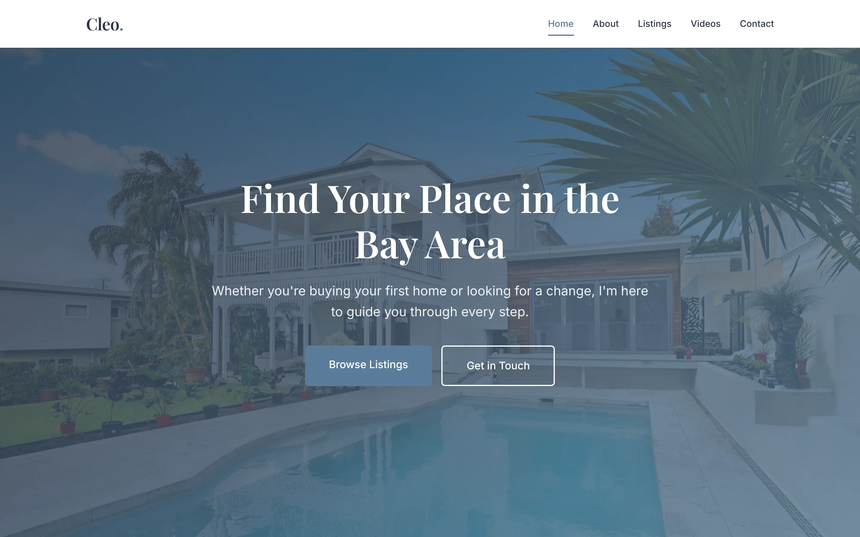
Where it started: a tidy but generic template. The listings were invented, the contact form pretended to send, and the About photo was an expired Instagram link. 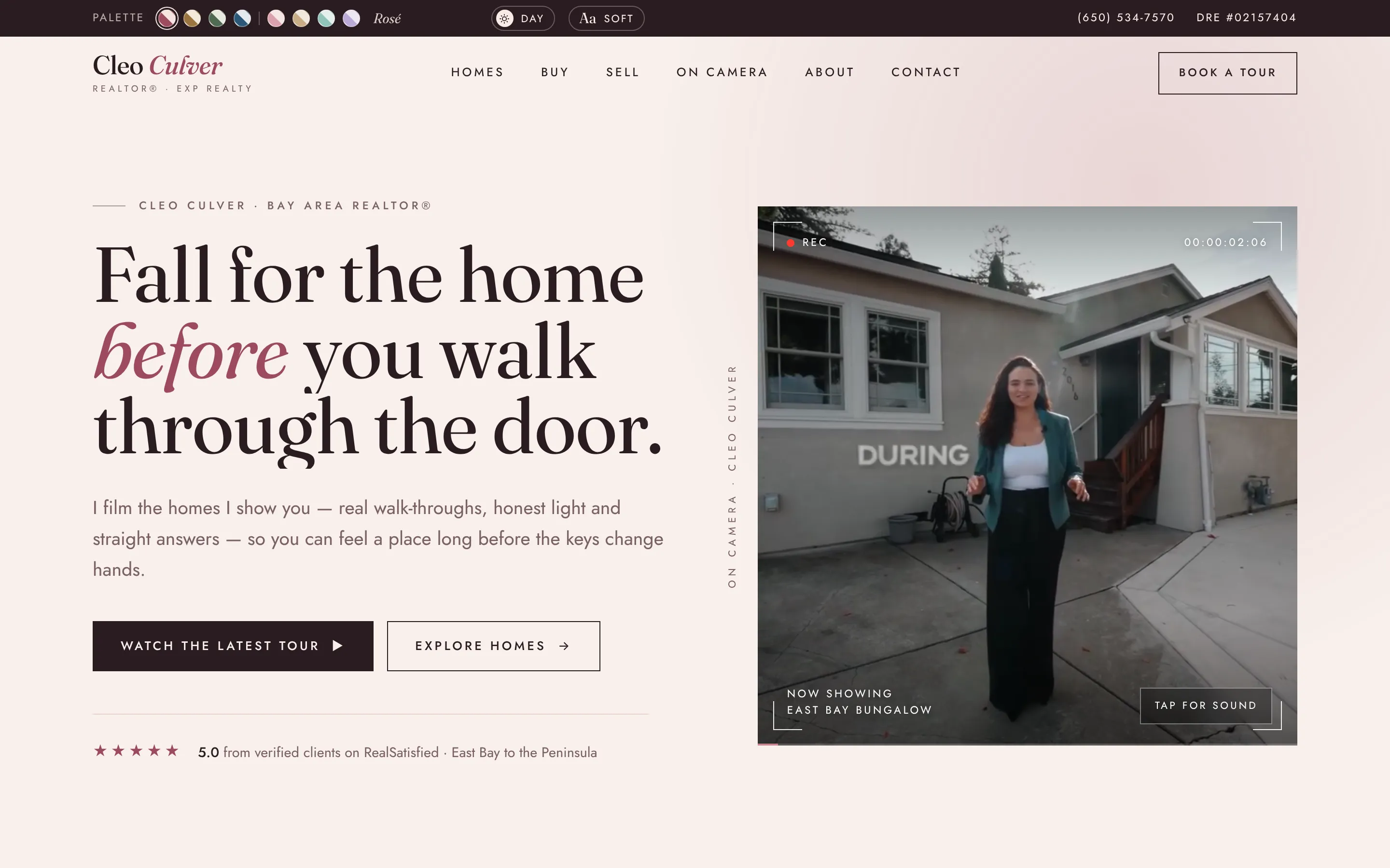
"Fall for the home before you walk through the door." The hero is a camera viewfinder — her own tour plays muted, with a REC light, live timecode and tap-for-sound. 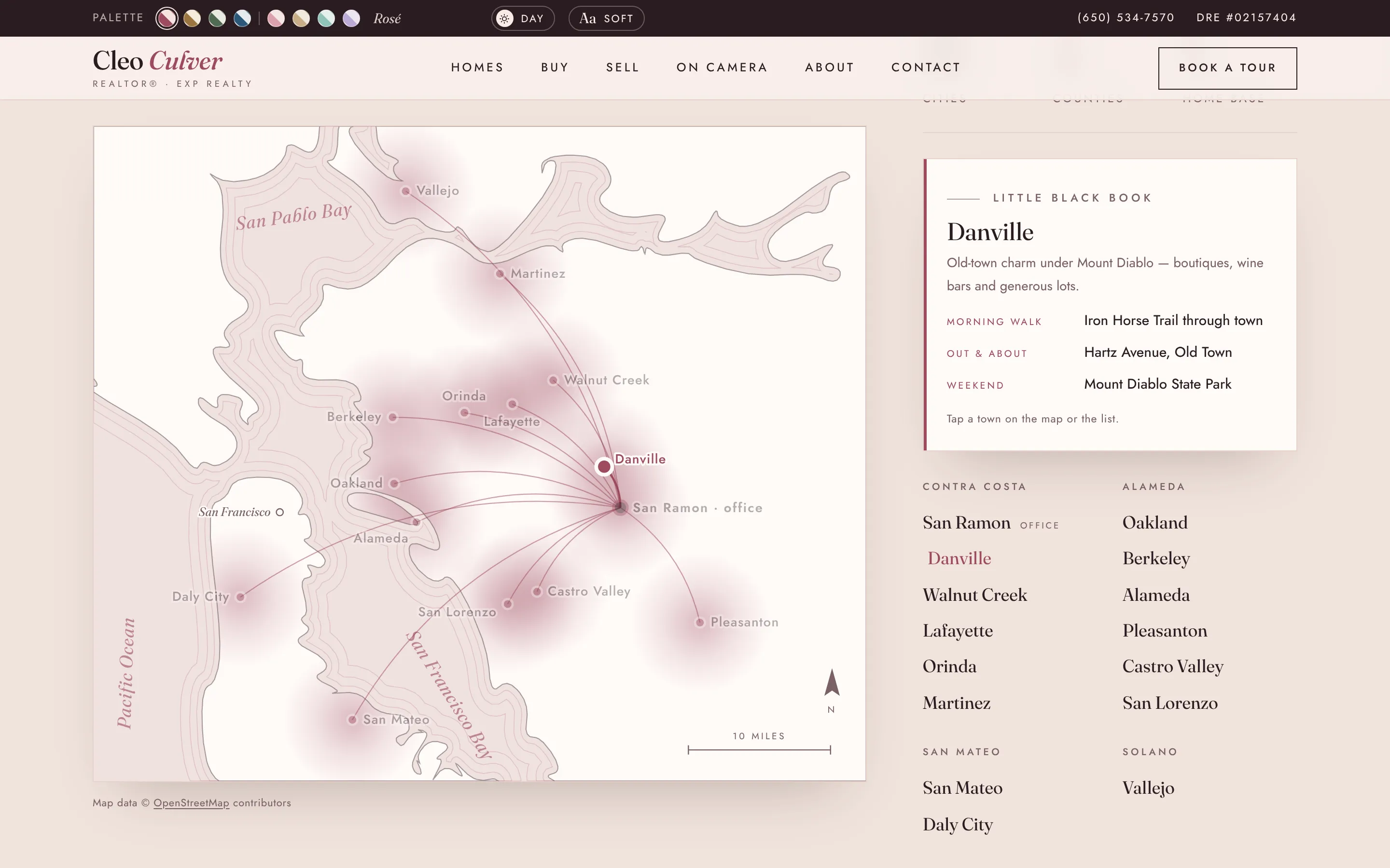
The coverage map: a real Bay Area coastline from OpenStreetMap, smoothed and drawn in on scroll. Routes fan out from her office; tapping a town updates the little-black-book card. 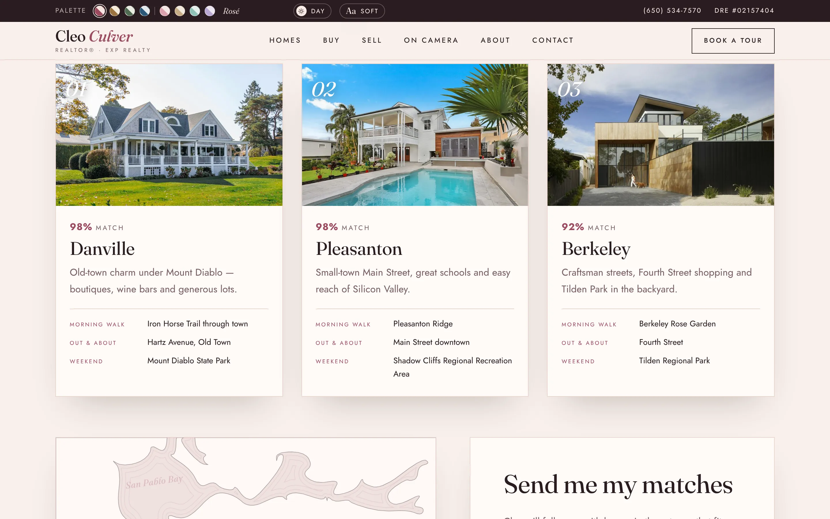
Find your Bay Area — six picture questions scored against fifteen towns, with the top three lit up on the map and a form that sends them to her. 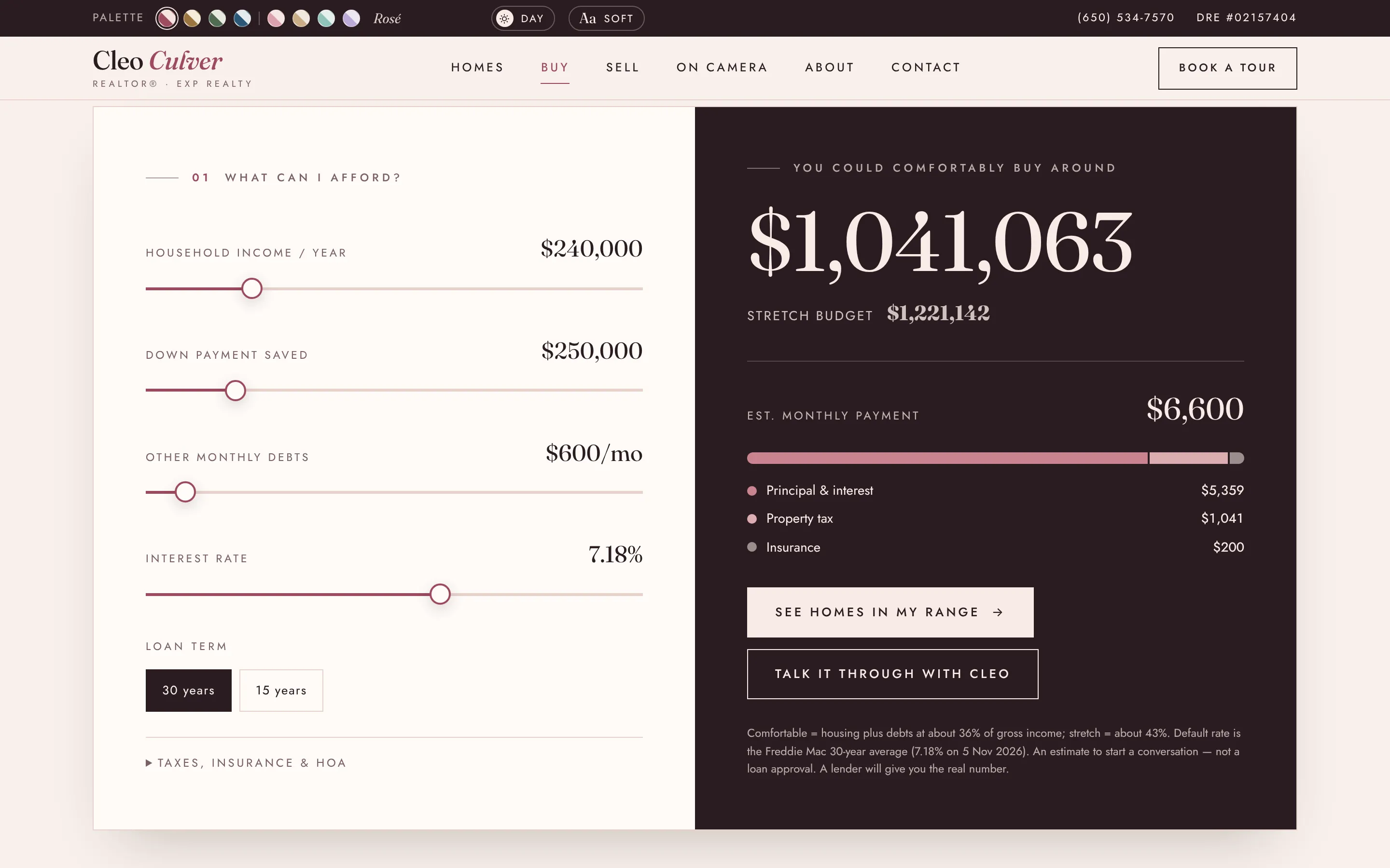
What can I afford? Comfortable and stretch budgets, mortgage insurance under 20% down, and a live payment breakdown, seeded with the current Freddie Mac rate. 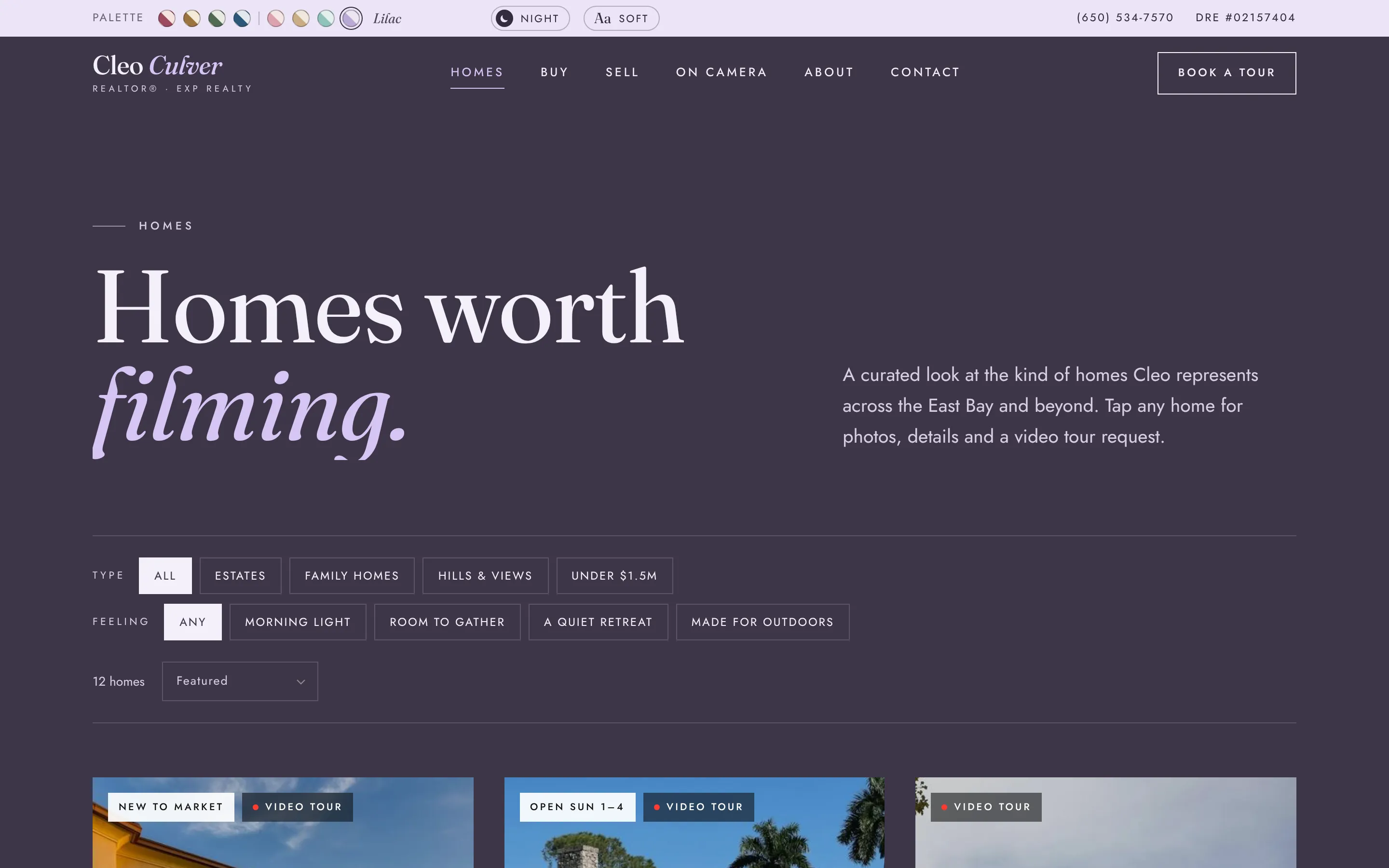
One of eight palettes — Lilac at night. Every page re-themes live from the top bar, so the client chose by trying them on rather than from swatches. 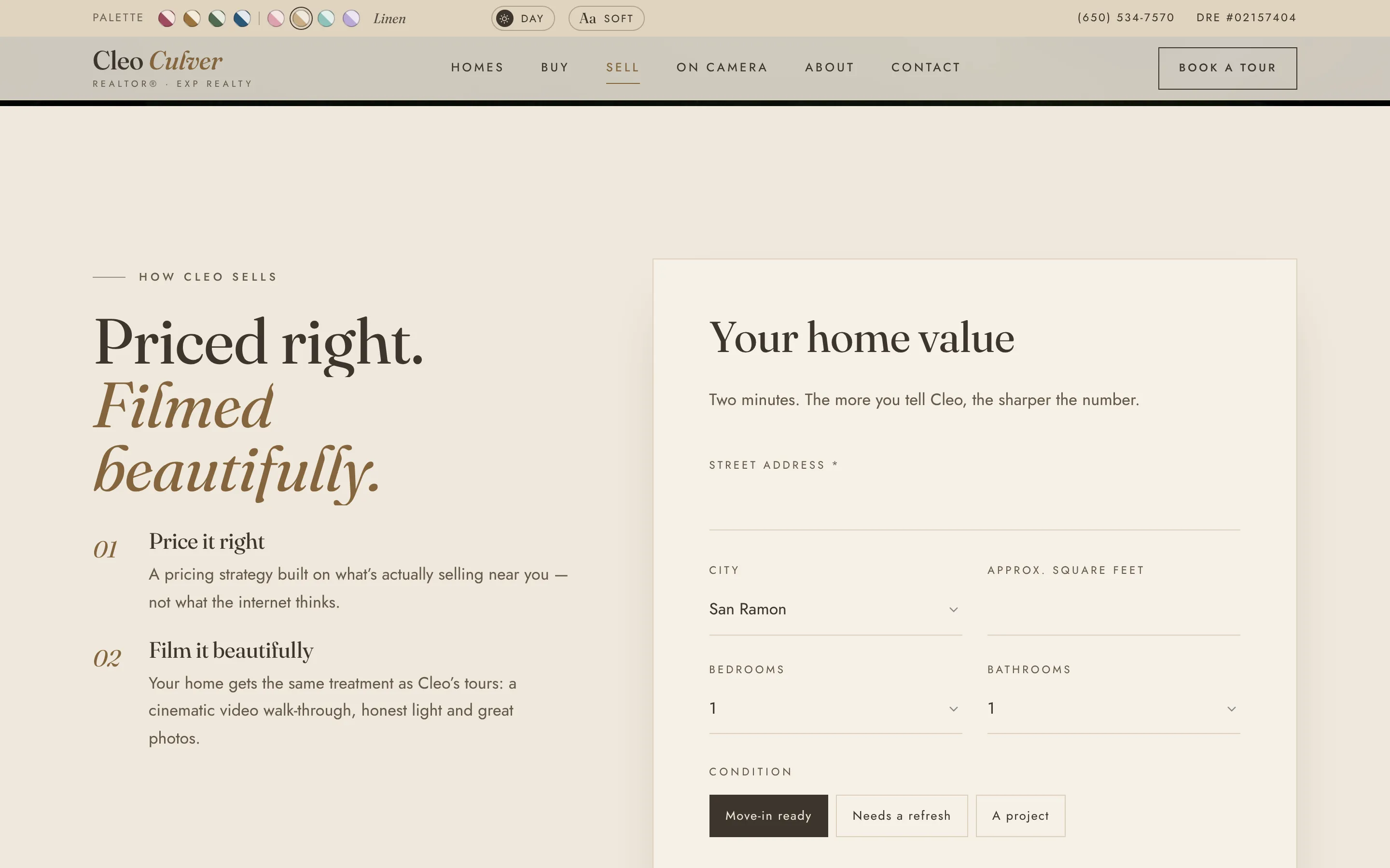
What's your home worth? A seller page in the Linen palette. With inventory this tight, a seller lead is worth more than a buyer lead. 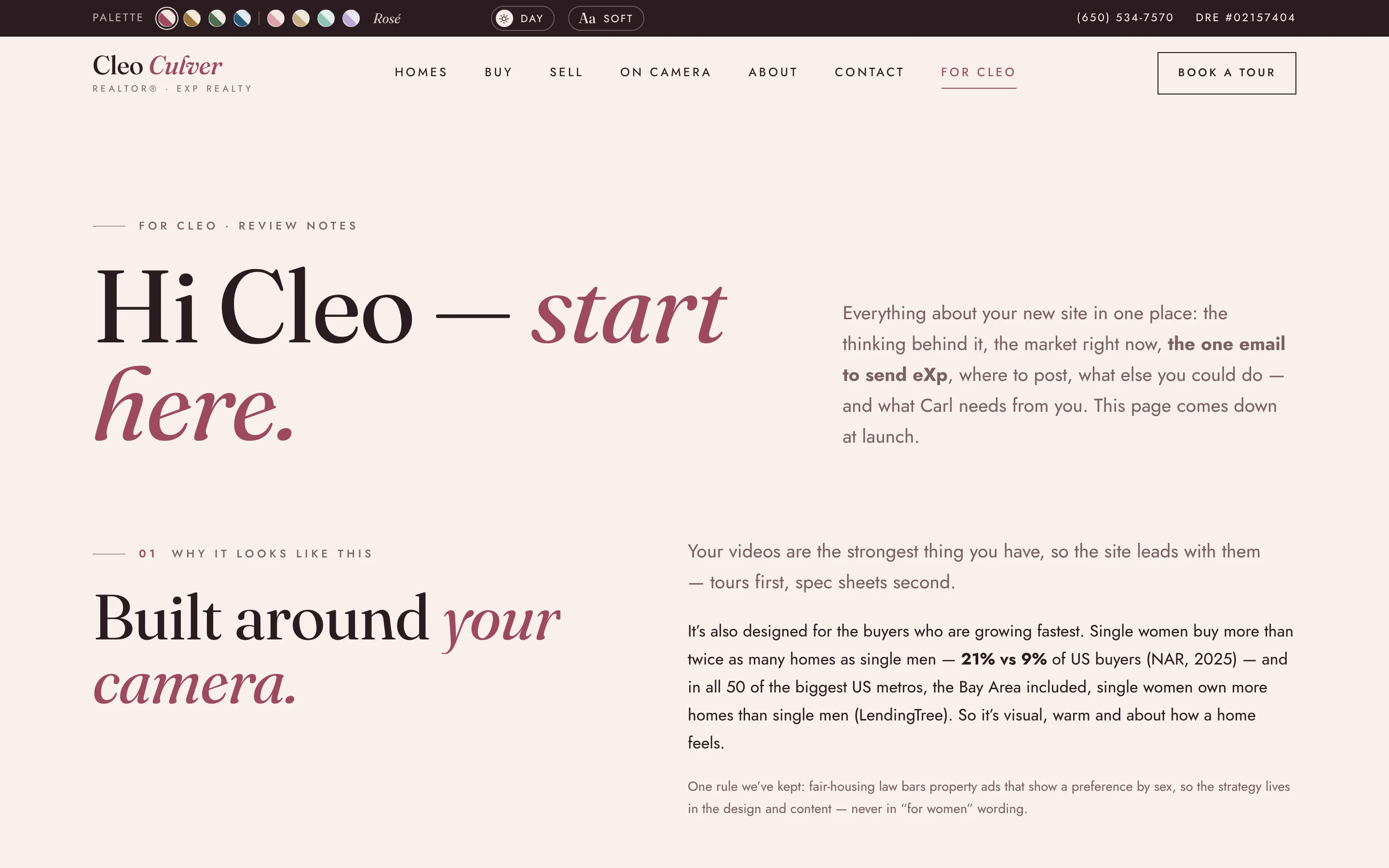
The briefing page, in the site's own menu instead of a long email: the research behind the design, the market in six numbers, the one message to send eXp with a copy button, and a to-do list that remembers her ticks. It comes down at launch.